In a recent post entitled Testing the Rhetoric of Sustainability, I focused on an article from The Economist‘s special report prognosticating about the upcoming year [The World in 2009]. An article focusing on Africa had an interesting twist, it talked about shedding some much needed light on the Dark Continent by creating maps [“Putting Africa on the map,” by J.M. Ledgard].
“It will be the year of the map in Africa. Not just street directions uploaded to mobile phones for the befuddled, although that will be a blessing on a continent where often the only address is a post-office box, but internet maps galore, most of them available to the public. This will do more than any political initiative in 2009 to determine exactly where money should best be spent in Africa.”
Claiming that maps “will do more than any political initiative” in helping Africa to develop is a pretty bold statement, but one from which Ledgard doesn’t back down. He continues:
“It is hard to overestimate how important a shift this is for Africa, says Oxford University’s Bob Snow, who heads the Wellcome Trust’s anti-malaria initiative in Kenya. Back in 1989, when the program was set up in Kilifi on the Kenyan coast, it took Mr Snow 12 letters and several months to get a map of Kilifi district. A request had to be filed with the ministry of health to go to the ministry of planning, which would then request the mapping division to allow release of a map—if the army approved.”
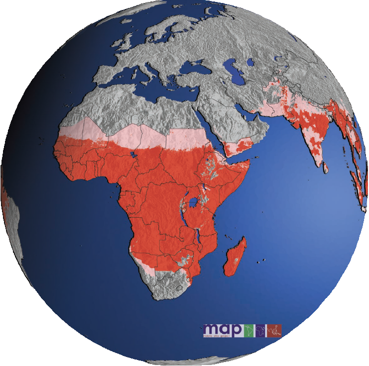
With mapping technologies improving, scientists, healthcare workers, civil engineers, urban planners, NGOs and others are finding that detailed maps can visually provide information that makes more sense and is more easily understood than numbers on a page. Tracking malaria is one use of such maps. The attached image shows the areas in Africa most at risk [source: http://www.map.ox.ac.uk/]. Of course, the megadata it contains is not granular enough to plan local anti-malaria campaigns, but it can be parsed into much finer maps that do provide that information.

“Digital mapping is nothing new, says Tim Robinson of the United Nations Food and Agriculture Organization. But its possibilities have grown with satellite data, and new technology for storage. ‘No more tapes and dodgy optical disks—you simply buy a new stack of hard drives.’ The kind of maps which in the past had been held to ransom by secretive African governments will pop up in an African internet café in less than a minute in 2009. Many will be annotated ‘wiki’ style, with layers of information added and verified by an online community: street names for all, distribution of infant deaths for development workers, livestock density for agricultural officials, Catholic primary schools for a local bishop, and YouTube videos on the best snorkelling spots for tourists. The head of the East Africa office of Google, Joseph Mucheru, says these maps will lead a push for more local information in Africa and ‘will allow you to see parts of your own country you haven’t seen before’.”
Ledgard’s point is that people all over the world are hungry for information but none more so than the people who have previously had little to no access to the kind of data now becoming available. Not only are Africans hungry for information, but information about them is important to the world.
“Africa harbours many of the planet’s most infectious diseases. Urban migration within Africa and air travel from Africa to the rest of the world have increased the risk of them spreading, but detection has been limited. Mark Smolinski, a ‘disease threat detective’ at Google.org, the philanthropic arm of the internet company, points out that the first clinical case of HIV-AIDS can now be traced back to Africa in 1959, but was not identified until 1981. By using digital maps of Africa and overlaying them with information of interest to researchers, such as local consumption of bush meat, Mr Smolinski believes teams of epidemiologists working together with medical workers texting in information from their mobile phones will do a better job of tracking exotic pathogens before they become mass killers. Similarly, aid workers in 2009 will use digital maps for realtime information on famines and conflict, starting with an acute famine in Ethiopia.”
If you’re interested in reading more about the famine in Ethiopia, read my post entitled Famine in the Horn of Africa. What makes digital mapping so informative is the way that desired information can be layered and displayed. It provides perspectives that are otherwise difficult to envision.
“The maps on Google and other sites are too general to produce new data for scientific research, but they will serve to disseminate the findings of scientists to African policymakers and the public, changing the way money is spent. Mr Snow cites a map of malaria incidence in Somalia, a country too dangerous for epidemiologists to visit. A glance at the map shows that much of the money to treat the disease goes to the north of Somalia, where the incidence of malaria is lower. Expect more embarrassing maps to be pushed by activists, published in newspapers and waved around in government meetings across Africa.”
As a side note, the reason that most money to treat disease in Somalia goes to the north is that the north is more stable than the south (see my post More on Somalia). Layering a map of where preventative disease money is spent over a map of unstable areas would probably confirm that populations caught inside areas of conflict and instability are at a tremendous disadvantage. As I continue to stress, security is the foundation upon which development must build. In the past, anecdotes and pictures were the basis of many public relations efforts by activists and NGOs. Although they had some influence, they could have nowhere near the long-term impact that informative digital maps can have. That is why Ledgard is so insistent that mapping Africa will have a large and positive impact on people living there.


