Nowadays an oft-heard complaint is that we are being bombarded with so much data that we are being overloaded. Humankind has always struggled with how to make sense of the world around us. We draw pictures, develop taxonomies, create graphs, generate maps, and so forth. Good visualization of data helps us draw the maximum amount of benefit in the least amount of time from a large amount of data. Often in my business meetings, I use a white board or grab a scrap piece of paper to draw out an idea I’m trying to explain. These doodles often find their way into more formal PowerPoint presentations. Using visualization to enhance understanding is a tried and true method of knowledge transfer. Hence, the old adage, “a picture is worth a thousand words.” Geographic Information Systems (GIS) have been particularly useful for visualizing data associated with particular locations. Visualization can be so powerful that The Economist reports “interest groups around the world are using mapping tools and internet-based information sources to campaign for change” [“Mapping a better world,” 6 June 2009 print issue].
“Convincing people about the evils of housing segregation can be tough, says Barbara Samuels, a campaigner for fair housing at the American Civil Liberties Union (ACLU) of Maryland. ‘People say, “What’s so bad about living in an all-black neighborhood?”‘ she explains. But using a map that displays all the vacant houses in a segregated neighborhood, how few jobs exist there and how little public transport is available, ‘you can show graphically how people are segregated from opportunity,’ she says. ‘Maps help you take complex information and portray it in a clear, intuitive manner. You can show segregation in a way that talking about it doesn’t do.’ And compiling such maps is much easier than it used to be, thanks to new mapping tools and sources of information on the internet. Ms Samuels remembers, for example, the tedium of trying to draw basic data on maps by hand in the 1990s. But in 2005 she was able to use maps that displayed 14 indicators of opportunity—created for her by a mapping-technology specialist—to help win a housing-desegregation court case.”
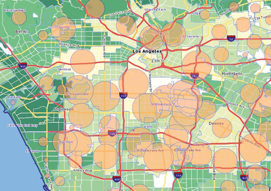 The attached map which accompanied the article quickly makes the point. It shows a region of Los Angeles, California, and how the presence of city parks can help reduce child obesity. Areas with fewer parks (lighter rather than darker green) have higher rates of childhood obesity (larger red circles). I’m sure there are other correlations that could be made, income levels, presence of fast food establishments, and so forth; but the bottom line is that the correlation between parks and obesity can be seen immediately. In regions that have been torn by years of conflict, maps have been used to help locate and disarm minefields. Because maps are visual, they are an important tool when trying to educate illiterate populations about the location and dangers of minefields.
Data visualization is becoming an important business area. One of the reasons that my colleague Tom Barnett is a much sought after keynote speaker is that he uses visualization as well as anyone I know to help explain the points he is trying to make. Visualization of ideas also helped former Vice President Al Gore to win a Nobel Peace Prize. BusinessWeek reports that “artists and designers are turning to data visualization to interpret the deluge of information around us, often with unexpected results” [“Data Visualization: Stories for the Information Age,” by Maria Popova, 12 August 2009]. Popova writes:
“At the intersection of art and algorithm, data visualization schematically abstracts information to bring about a deeper understanding of the data, wrapping it in an element of awe. While the practice of visually representing information is arguably the foundation of all design, a newfound fascination with data visualization has been emerging. … For artists and designers, data visualization is a new frontier of self-expression, powered by the proliferation of information and the evolution of available tools. For enterprise, it’s a platform for showcasing products and services in the context of the cultural interaction that surrounds them, reflecting consumers’ increasing demand for corporate transparency.”
Popova insists that data visualization is both art and science. It goes beyond the mere visual presentation of data to express something more.
“Data visualization has nothing to do with pie charts and bar graphs. And it’s only marginally related to ‘infographics,’ information design that tends to be about objectivity and clarification. Such representations simply offer another iteration of the data—restating it visually and making it easier to digest. Data visualization, on the other hand, is an interpretation, a different way to look at and think about data that often exposes complex patterns or correlations. Data visualization is a way to make sense of the ever-increasing stream of information with which we’re bombarded and provides a creative antidote to the ‘analysis paralysis’ that can result from the burden of processing such a large volume of information. ‘It’s not about clarifying data,’ says Koblin. ‘It’s about contextualizing it.’ Today algorithmically inspired artists are re-imagining the art-science continuum through work that frames the left-brain analysis of data in a right-brain creative story. Some use data visualization as a bridge between alienating information and its emotional impact.”
Frankly, when you look at some of the stunningly beautiful ways that data is displayed in examples accompanying the article, data visualization appears to be much more about art than science; more about composition than clarity. As a businessman, clarity remains the most important objective when visualizing data. Sometimes art and science do merge to bring vibrant composition together with crystal clarity. One group that does this amazingly well is Gapminder. Gapminder’s website trumpets the fact that it brings “the beauty of statistics for a fact based world view” to the public. To get an idea about how powerful visualization of data can be, watch the video 200 years that changed the world.
The video helps explain why I remain optimistic about the future of emerging market countries. It also demonstrates how well visualization can help us better understand the world around us. Visualization is a powerful tool and I’m glad it’s finally getting the recognition it deserves.